Adobe recently released Lightroom Mobile, their tablet integration efforts for Lightroom desktops. In order to try the software for 30 days you need to be running Lightroom 5, going beyond that will require a Creative Cloud subscription (min version being Photoshop & Lightroom CC @ $10/month).
I was curious to see how well this would work, as Lightroom is a desktop heavy application focused on very large files & workflows. Thus far, only collections (and not smart collections) can be synchronized by selecting the Sync Collection icon which is available after signing in with an Adobe ID. After a collection has been set to synchronize, Lightroom begins to upload metadata and smaller versions of the images to their cloud. For my case I created three separate albums, and roughly 1k total RAW images in my Lightroom collection to synchronize. Once started the sync took about 30 minutes, which seems reasonable given the amount of data to upload.
After signing into the iPad app for Lightroom Mobile, it began to download the collections which had been uploaded. This seemed to go at about the same speed as the upload, and was completed roughly a half hour later.
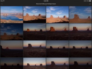
After the collections have been synchronized, they are ready to be used. On first opening a collection you will see all photos available in a grid view.
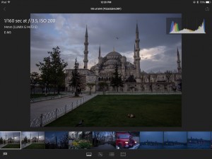
After selecting a photo, an initial low resolution version of the photo will be displayed, along with a spinning swirl to indicate the application is still working. After a variable amount of time (times seem to range from 3-10 seconds on my iPad 3) the image is displayed in a higher resolution format, and other details like ISO, f stop, and shutter are displayed. Adobe notes that older iPads such as mine have poor performance for this step compared with newer ones. The time to open files seemed to go down as it built an internal cache, so it may be one of those cases were opening an album and leaving it for a bit will improve overall performance.
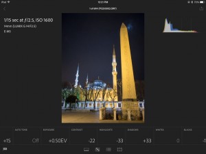
The photo can also be edited using some of the simple controls in Lightroom. Given the smaller screen and potentially questionable color representation (though Apple is better than most at this), this is probably more of a rough starting point for editing rather than a finishing touch.
Ultimately for me, the most useful feature of the app is swipe up and down to flag or un-flag photos for quick editing of a group of photos. Unfortunately there is not currently any ability to see or edit meta data elements like captions, tags, or other elements. This is sorely lacking. Updating meta data can be one of the more time consuming and bothersome parts of photography, and having the ability to add or edit when I have some downtime would be a nice addition. Until then, $10/m for mobile functionality (as I already own the desktop version of Lightroom) doesn’t quite make sense.


